Plotting graphs
Plotting graphs is a very common tool for illustrating results in science. MATLAB has many commmands that can be used for creating various kinds of plots.
Easy plots
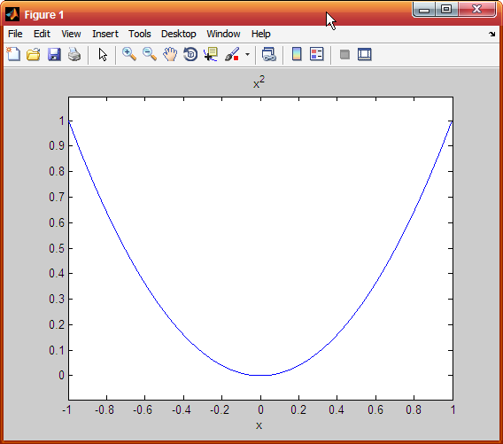
The simplest buit-in function for plotting an explicit function is ezplot command. For example, we want to plot a parabola on the interval [-1,1]
We can simply use the following command:
>> ezplot('x^2',[-1 1])
The first input of ezplot command is a string describing the function. The second input (which is optional) is the interval of interest in the graph. Note that the function description is not necessarily a function in x variable. We can use any variable we like:
>> ezplot('sin(b)',[-2 3])
If the function definition involves some constant parameter, write it explicitly:
>> ezplot('x^2+2')
In this case, if we assign a value 2 to a variable first, says y=2, when executing:
>> y = 2;
>> ezplot('x^2+y')
MATLAB will interpret y as a variable (not a value of 2). Hence, it will create a contour plot of the function


Another related command is fplot. It is used to plot a function with the form  between specified limits.
Plot command
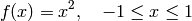
The plot command is used to create a two-dimensional plot. The simplest form of the command is:
plot(x,y)
where x and y are each a vector. Both vector must have the same number of elements.
For example:
>> x = 0:0.1:5;
>> y = exp(-x);
>> plot(x,y)
Once the plot command is executed, the figure Window opens and the plot is displayed
The plot appears on the screen in blue which is the default line color.
The plot command has additional arguments that can be used to specify the color and style of the line and the color and type of markers, if any are desired. With these options the command has the form:
plot(x,y,'linespec','PropertyName',PropertyValue)
Line Specifiers (linespec)
Line specifiers are optional and can ce used to define the style and color of the line and the type of markers (if markers are desired). The line style specifiers are:
| Line Style | Specifier |
|---|---|
| solid (default) | - |
| dashed | -- |
| dotted | : |
| dash-dot | -. |
The line color specifiers are:
| Line Color | Specifier |
|---|---|
| red | r |
| green | g |
| blue | b |
| cyan | c |
| magenta | m |
| yellow | y |
| black | k |
| white | w |
The marker type specifiers are:
| Marker Type | Specifier |
|---|---|
| plus sign | + |
| circle | o |
| asterisk | * |
| point | . |
| cross | x |
| triangle (pointed up) | ^ |
| triangle (pointed down) | v |
| square | s |
| diamond | d |
| five-pointed star | p |
| sixed-pointed star | h |
| triangle (pointed left) | < |
| triangle (pointed right) | > |
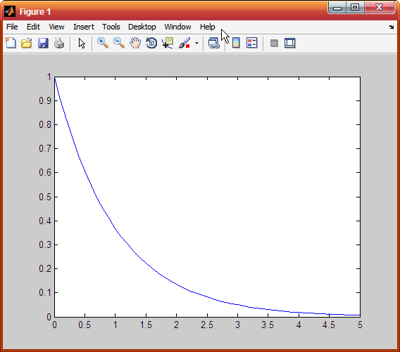
The specifiers are typed inside the plot command as strings. Within the string, the specifiers can be typed in any order and the specifiers are optional. For example:
>> x = 0:5; y = 2.^x; plot(x,y,'-or')
This command creates a plot with solid red line and the marker is a circle.
Property Name and PropertyValue
Properties are optional and can be used to specify the thickness of the line, the size of the marker, and the colors of the marker’s edge line and fill. The Property Name is typed as a string, followed by a comma and a value for the property, all inside the plot command.
| Property Name | Description |
|---|---|
| linewidth | the width of the line (default 0.5, possible values are 1,2,3,...) |
| markersize | the size of the marker (e.g., 5,6,... ) |
| markeredgecolor | the color of the edge line for filled marker (e.g., r, b) |
| markerfacecolor | the color of the filling for filled markers (e.g, r, b) |
For example, the command:
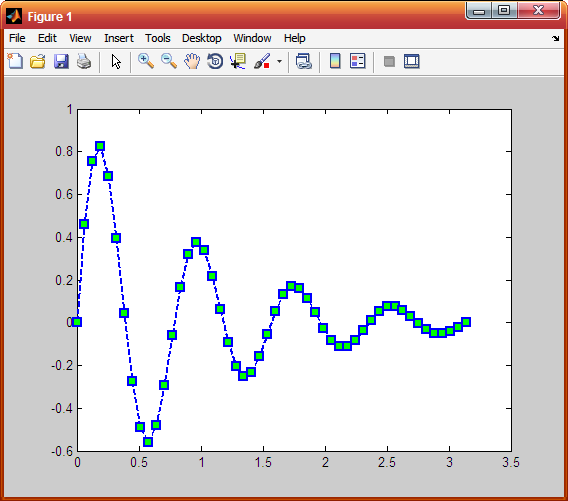
>> x = linspace(0,pi,50); y = exp(-x).*sin(8*x);
>> plot(x,y,'--sb','linewidth',2,'markersize',8,'markerfacecolor','g')
creates a plot with a blue dashed line and squares as markers. The linewidth is 2 points and the size of the square markers is 8 points. The marker has green filling.
Formatting a plot
Plots can be formatted by using MATLAB command that follow the plot or fplot commands, or interactively by using the plot editor in the Figure Window. Here we will explain the the first method which is more useful since a formatted plot can be created automatically every time the program is executed.
The xlabel and ylabel command
xlabel and ylabel create description on the x- and y-axes, respectively after we have plotted a graph. The usages are:
>> xlabel('text as string')
and:
>> ylabel('text as string')
The title command
A title can be added to the plot with the command:
>> title('text as string')
The text will appear on the top of the figure as a title.
The text command
A text label can be placed in the plot with the text or gtext commands:
>> text(x,y,'text as string')
>> gtext('text as string')
The text command places the text in the figure such that the first character is positioned at the point with the coordinates x,y (according to the axes of the figure). The gtext command places the text at a position specified by the user (with the mouse).
The legend command
The legend command places a legend on the plot. The legend shows a sample of the line type of each graph that is plotted, and places a label, specified by the user, beside the line sample. The usage is:
>> legend('string 1','string 2',... )
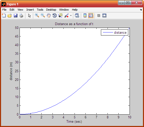
For example, the command:
>> t = linspace(0,10,100); s = t.^2/2;
>> plot(t,s);
>> xlabel('Time (sec)');
>> ylabel('distance (m)');
>> title('Distance as a function of t');
>> legend('distance')
creates a plot shown on the right.
Formatting the texts
The texts in the xlabel, ylabel, title, text and legend commands can be formatted to customize the font, size, style (italic, bold, etc.), and color. Formatting can be done by adding optional PropertyName and PropertyValue arguments following the string inside the command. For example:
>> text(x,y,'text as string','PropertyName',PropertyValue)
Some of the PropertyName are:
| Property Name | Description |
|---|---|
| Rotation | the orientation of the text (in degree) |
| FontSize | the size of the font (in points) |
| FontWeight | the weight of the characters (light, normal, bold) |
| Color | the color of the text (e.g., r, b, etc.) |
Some formatting can also be done by adding modifiers inside the string. For example, adding \bf, \it, or \rm, will create a text in bold font, italic style, and with normal font, rexpectively. A single character can be displayed as a subscript or a superscript by typing _ (the underscore character) or ^ in front of the character, respectively. A long superscript or subscript can be typed inside { } following the _ or the ^. For example:
>> title('\bf The values of X_{ij}', 'FontSize',18)
Greek characters
Greek characters can be included in the text by typing \ (back slash) before the name of the letter.
| Character | Letter |
|---|---|
| \alpha |  |
| \beta |  |
| \gamma |  |
| \theta |  |
| \pi |  |
| \sigma |  |
The axis command
When the plot(x,y) command is executed, MATLAB creates axes with limits that are based on the minimum and maximum values of the elements of x and y. The axis command can be used to change the range of the axes. Here are some possible forms of the axis command:
| Commands | Description |
|---|---|
| axis([xmin, xmax, ymin, ymax]) | sets the limits of both x and y |
| axis equal | sets the same scale for both axes |
| axis square | sets the axes region to be square |
| axis tight | sets the axis limits to the range of the data |
The grid command
grid on adds grid lines to the plot. grid off removes grid lines from the plot.
For example:
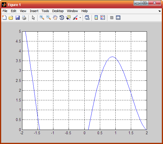
>> fplot('x^2+4*sin(2*x)-1',[-3 3])
>> grid on
>> axis([-2 2 0 5])
Plotting multiple graphs
In may situations there is a need to make several graphs in the same plot. There are two methods to plot multiple graphs in one figure. One is by using the plot command, the other is by using the hold on, hold off commands.
1. Using the plot command
Two or more graphs can be created in the same plot by typing pairs of vectors inside the plot command. For example:
>> plot(x,y,u,v,s,t)
creates 3 graphs: y vs x, v vs u, and t vs s, all in the same plot. The vector of each pair must have the same length. MATLAB automatically plots the graphs in different colors so that they can be identified. It is also possible to add line specifiers following each pair. For example:
>> plot(x,y,'-bo',u,v,'--rx',s,t,'g:s')
plots y vs x with a solid blue line and circles, v vs u with a dashed red lines with cross signs, t vs s with a dotted green line and square markers.
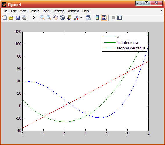
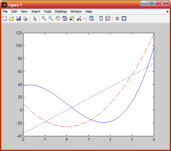
For example, we plot the function  , and its first derivative
  and second derivatives
  , for
, for  , all in the same plot. A script file that creates these graphs can be written as:
>> x = linspace(-2,4,20);
>> y = 3*x.^3-26*x+10;
>> dy = 9*x.^2-26;
>> ddy = 18*x;
>> ddy = 18*x;
>> plot(x,y,x,dy,x,ddy);
>> legend('y','first derivative','second derivative');
The default colors of multiple graphs in MATLAB start from blue, red, and green, respectively.
2. Using the hold on, hold off command
To plot several graphs using the hold on, hold off commands, one graph is plotted first with the plot command. Then the hold on command is typed. This keeps the Figure Window with the first plot open, including the axis properties and the formatting. Additional graphs can be added with plot commands that are typed next. The hold off command stops this process. It returns MATLAB to the default mode in which the plot command erases the previous plot and resets the axis properties.
With the data from the previous example, we can plot y and its derivatives by typing commands shown in the script:
>> plot(x,y,'-b');
>> hold on
>> plot(x,dy,'--r');
>> plot(x,ddy,':k');
>> hold off
Logarithmic Scales
The semilogy function plots x data on linear axes and y data on logarithmic axes. The semilogx function plots x data on logarithmic axes and y data on linear axes. The loglog function plots both x and y data on logarithmic axes.
For example, notice the difference between the two commands:
>> x = logspace(0,3,100);
>> y = x.^2;
>> semilogy(x,y)
>> loglog(x,y)
(The logspace creates a vector of 100 elements in log scale with the first element 10^0 and the last element 10^(3).)
Polar plots
The polar command is used to plot functions in polar coordinates. The command has the form:
>> polor(theta,radius,'linespec')
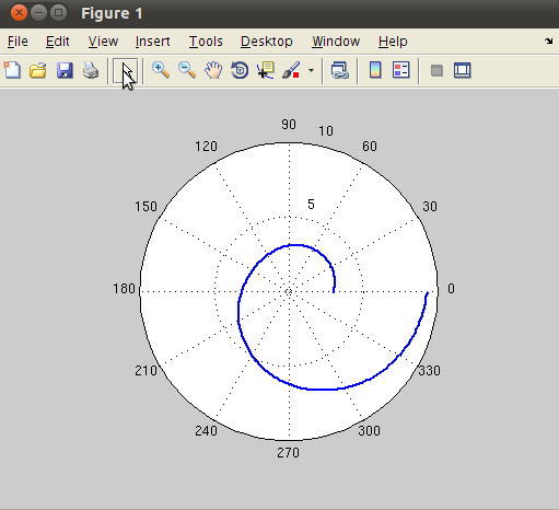
where theta and radius are vectors whose elements define the coordinates of the points to be plotted. The line specifiers are the same as in the plot command. To plot a function  in a certain domain, a vector for values of is created first, and then a vector
  with the corresponding values of
  is created using element-wise calculation.
For example, a plot of the function

is done by:
>> theta = linspace(0,2*pi,200);
>> r = 3*cos(theta/2).^2+theta;
>> polar(theta,r)
Multiple plots on the same window
Multiple plots on the same page can be created with the subplot command, which has the form:
>> subplot(m,n,p)
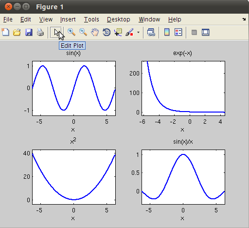
The command divides the Figure Window into mxn rectangular subplots where plots will be created. The subplots are arranged like elements in a mxn matrix where each element is a subplot. The subplots are numbered from 1 through mn. The number increases from left to right within a row, from the first row to the last. The command subplot(m,n,p) makes the subplot p current. This means that the next plot command will create a plot in this subplot.
For example, we create a plot that has 2 rows and 2 columns:
>> subplot(2,2,1);ezplot('sin(x)');
>> subplot(2,2,2);ezplot('exp(-x)');
>> subplot(2,2,3);ezplot('x^2');
>> subplot(2,2,4);ezplot('sin(x)/x');
Multiple Figure Windows
When the plot or any other commands that generates a plot is executed, the Figure Window opens and displays the plot. If a Figure Window is already open and the plot command is executed, a new plot will replace the existing plot. It is also possible to open additional Figure Window. This is done by typing the command figure. Every time the command figure is entered, MATLAB opens a new Figure Window and after than we can enter the plot command to generate a plot in the last active Figure Window.
The figure command can also have an input argument that is an integer figure(n). The number corresponds to the number of a corresponding Figure Window. Figure Windows can be closed with the close command. Several forms of the commmand are:
- close closes the active Figure Window
- close(n) closes the nth Figure Window
- close all closes all Figure Windows that are open
Other types of plots (bar, histogram)
We illustrate various kinds of plots by examples.
1. Vertical bar plots
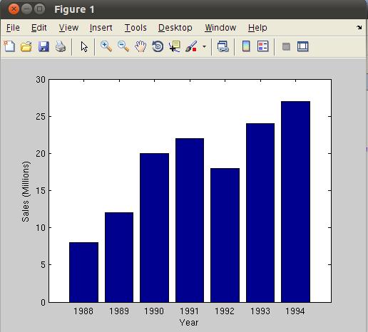
Function format: bar(x,y):
>> yr = [1988:1994];
>> sle = [8 12 20 22 18 24 27];
>> bar(yr,sle);xlabel('Year');
>> ylabel('Sales (Millions)');
2. Horizontal bar plots
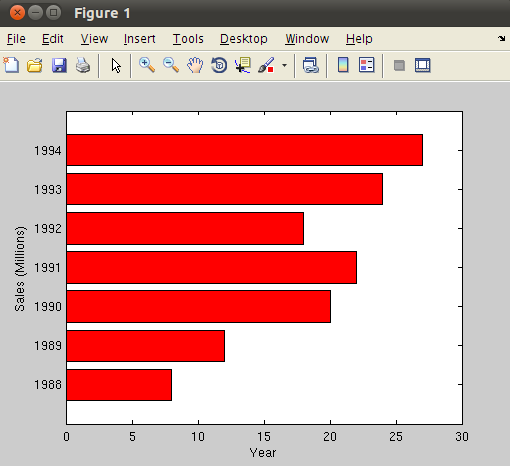
Function format: barh(x,y):
>> yr = [1988:1994];
>> sle = [8 12 20 22 18 24 27];
>> barh(yr,sle,'r');
>> xlabel('Year');ylabel('Sales (Millions)');
3. Stairs plots
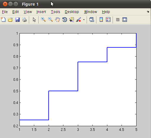
Function format: stairs(x,y):
>> k=1:5;pmf = [1/4 1/4 1/4 1/8 1/8];
>> cdf =cumsum(pmf);
>> stairs(k,cdf);
6. Histograms
Histograms are plots that show the distribution of data. The overall range of a given set of data points is divided to smaller subranges (bins), and the histogram shows how many data points are in each bin. The height of the bar corresponds to the number of data points in the bin. The simplest form of the command is:
>> hist(y,M)
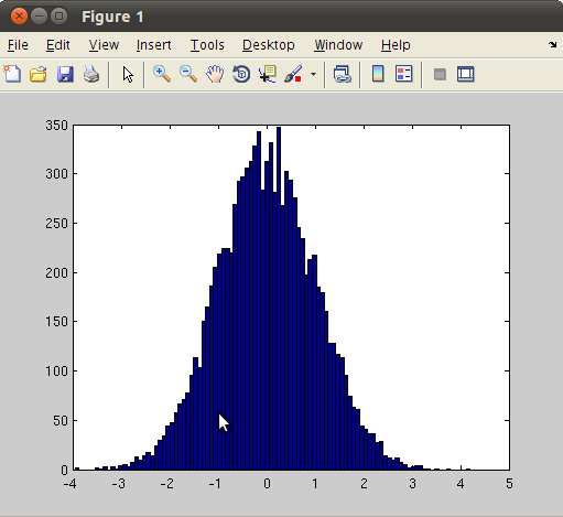
where y is a vector with the data points, and M is the number of bins. For example, we generate 10000 random numbers according to Gaussian distribution. Its histogram should look like a bell curve (due to  term in the density function). This is done by typing:
>> y = randn(10000,1);
>> hist(y,100)
3-D plots
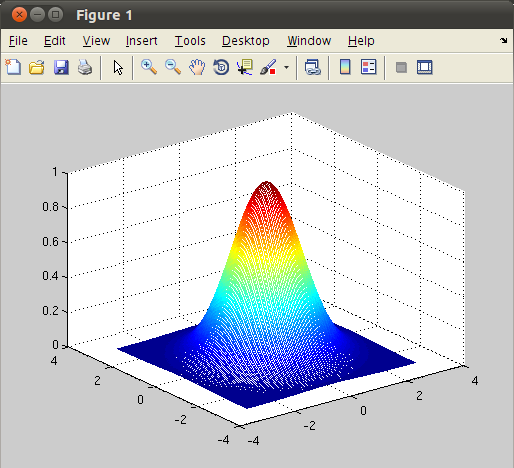
Surface, mesh, and contour plots are convenient ways to represent data that is a function of two independent variables, says  . To plot data, a user must create three equal-sized arrays x,y, and z. The vector x and y contain the x values and the y values, and the vector z contains the function values associated with every point of x and y.
MATLAB function meshgrid makes it easy to create the vector x,y arrays required for these plots. Then we evaluate the function values to plot at each of those (x,y) locations. Finally we call function mesh,surf or contour to create the plot. For example, we plot the 2-dimensional Gaussian density function
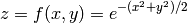
This is done by typing:
>> [x,y]=meshgrid(-3:0.05:3);
>> z = exp(-0.5*(x.^2+y.^2));
>> mesh(x,y,z)
Exercises
- Write a MATLAB script to plot
 versus
  from 0 to
  in steps of
  . The points should be connected by a 2-pt red line and each point should be marked with a 6-pt wide blue circular marker.
 - Write a MATLAB script to plot the magnitude of
 where
where
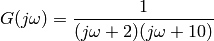
for  to
to  in log scale with 200 points. Plot the graph in log scale for both x and y axes.
- The position
 as a function of time of a particle that moves along a straight line is given by

Use subplot command to make the three plots of position, velocity, and acceleration on the same page.
- Generate 10000 random numbers according to a uniform distribution on the interval [-5,5]. Plot the histogram of the data and discuss the result.